Plain
Altin Steakhouse
A multilingual restaurant site with a seasonal menu and table booking.

Paper and inkand a little haze
A design system and site starter by a2Studio, built for restaurants, studios and small shops.
01 — Principles
Warm ivory backgrounds and brown-black ink. Never pure white, never pure black.
A serif for what you say, a sans for what you do. Sentence case everywhere — never capitalised titles.
The handwritten wordmark appears once per page. Its rarity is what makes it feel personal.
Static HTML, one CSS file, self-hosted fonts. The haze is CSS, not an image. No JS unless a feature needs it.
02 — Wordmark
Set in Damion, a smooth, connected brush-pen hand. Always lowercase. Use it for the logo and, at most, one signature word in a hero — never for headings or body text.
Do
Don't
03 — Colour
Neutrals do 95% of the work. Clay is the only accent: fill it, mark with it, focus with it — but use --clay-text for small type. Every text pair below passes WCAG AA. Gesso is light only — there is no dark mode.
--paperPage background--paper-2Wells, code, hover--paper-3Pressed, selected--cardRaised surfaces--inkBody text · 15.2:1--ink-2Secondary · 6.7:1--ink-3Captions · 4.7:1--clayFills, marks, focus--clay-textLinks · 4.8:1--okSuccess--warnCaution--errorFailure--haze-sky--haze-mist--haze-cream--haze-honey--haze-peach--haze-blush04 — Typography
Measured on anthropic.com and copied as a system, not a mood. The sans does the work: headings in bold, interface, body, meta. The serif is the reading and feeling voice: long text, statements and display names. Their faces are licensed, so Gesso ships free, self-hosted equivalents.
Aa
Source Serif 4
Serif: reading text, statements, display
Stand-in for Tiempos / Anthropic Serif, variable 200–900
--font-serifAa
Geist
Sans: headings in bold, interface, body, meta
Stand-in for Styrene / Anthropic Sans, variable 100–900
--font-sansAa
Geist Mono
Mono: prices, code, data
Tabular figures for prices and numbers
--font-monoAa
Damion
Hand: wordmark only
The "human" title — one word, lowercase
--font-handQuiet things last longer
Quiet things last longer
Quiet things last longer
Quiet things last longer
Quiet things last longer
Quiet things last longer
Quiet things last longer
Quiet things last longer
Quiet things last longer
Quiet things last longer
A bold sans lead says what it is. The serif carries on in the same sentence and says why it matters, in a calmer voice.
<p class="statement"><strong>What we do.</strong> Why it matters.</p>Do
Don't
Sentence case
Never capitalised
Applies to every title, heading, button, nav link, label and eyebrow. Only names keep their capitals (Zürich, Altin Steakhouse). No text-transform: uppercase anywhere. A label above a heading is one plain word or phrase — never a dotted keyword line like «Ristorante · Pizzeria · Bar».
Clear, personal and unhurried. You read it once and remember who sent it.
Long text switches to the serif at 17 pixels, in a column about 720 pixels wide, so an article reads like a printed page. Headings stay in the bold sans. Numbers in tables use the mono and line up: CHF 1'480.00.
05 — Haze & grain
Soft blooms of light with film grain on top, taken from the "jermaine" reference. Pure CSS: layered radial gradients plus an SVG noise filter, under 1 KB. Use one haze per view — a hero, a featured card or a footer band.
.haze .haze--dusk .haze--mist .haze--paper <Haze variant="dawn" drift grain as="section">…</Haze>
<!-- or plain HTML -->
<section class="haze grain" data-drift>…</section>06 — Artwork
Two image styles, generated from the prompts in doc/art-direction.md without reference images. Web-sized .webp files live in public/pictures/; the full-size .jpg masters stay in pictures/ and are not deployed.
For heroes, banners and closing bands. Painted and film are blurred; canvas keeps the oil strokes. Keep the CSS .haze behind them as the loading fallback.
haze-dawn-painted
haze-dawn-film
haze-canvas-banner
haze-dusk
haze-mist-soft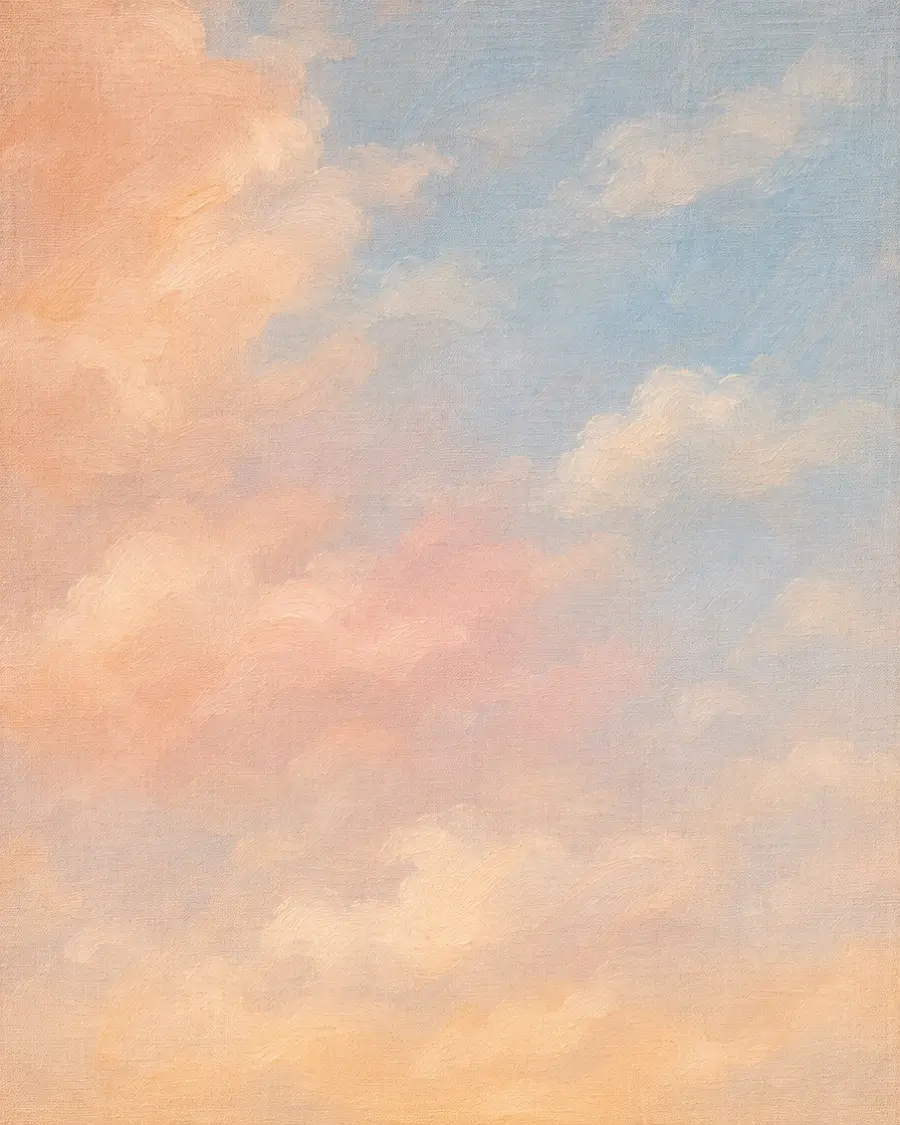
haze-canvas-dusk
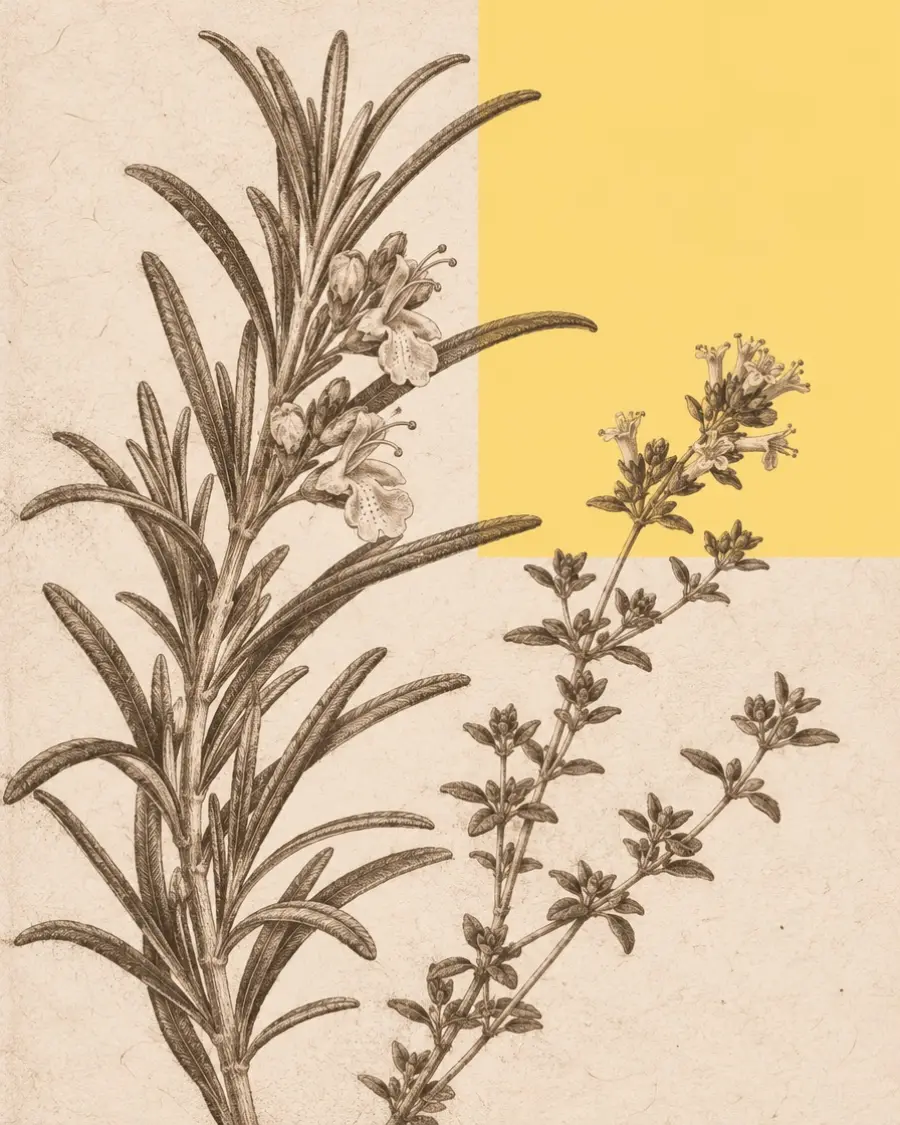
haze-film-mobileFor cards, case studies and journal posts. One engraving, one flat colour field, quiet paper. Sits on paper with a large radius and no shadow.
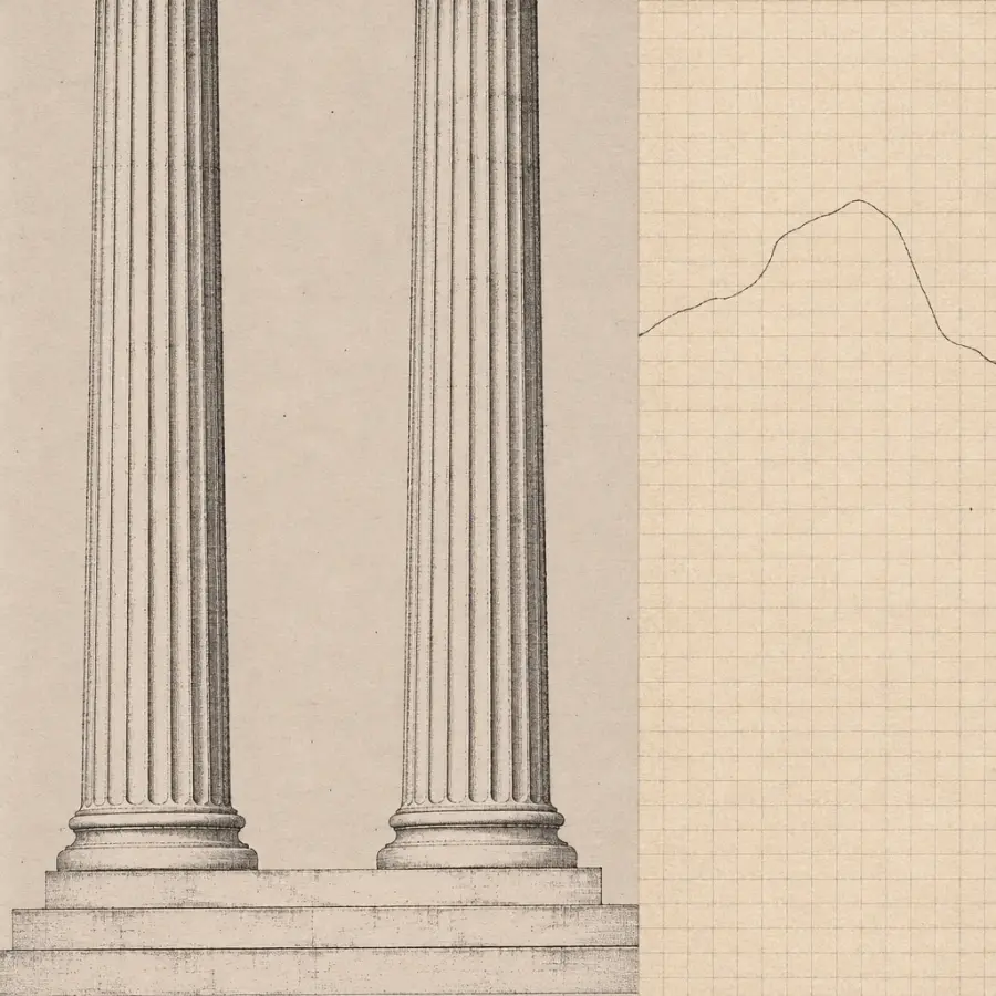
collage-columns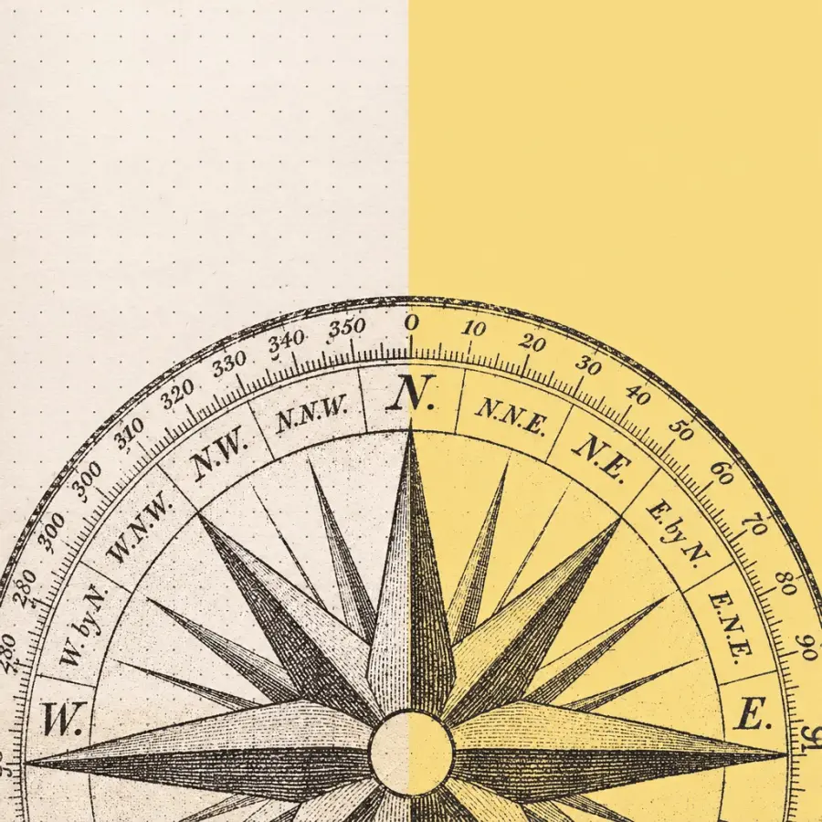
collage-compass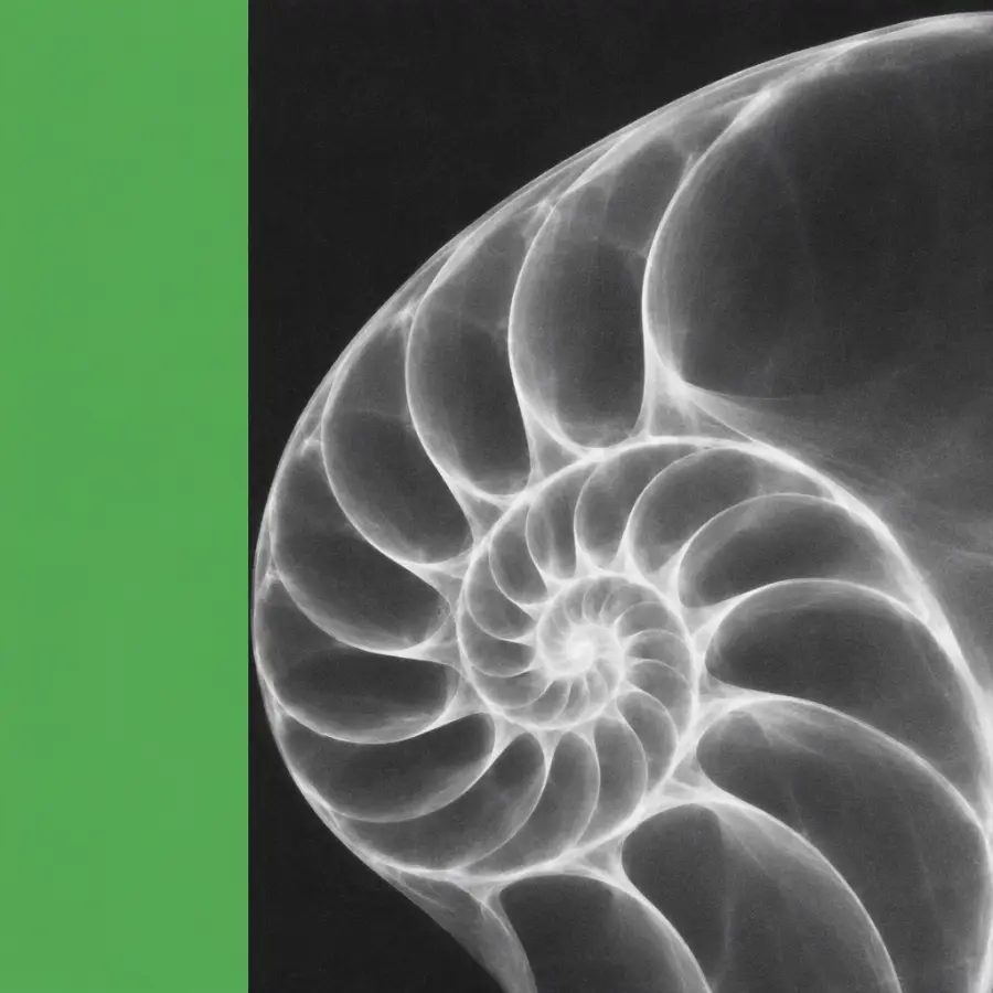
collage-nautilus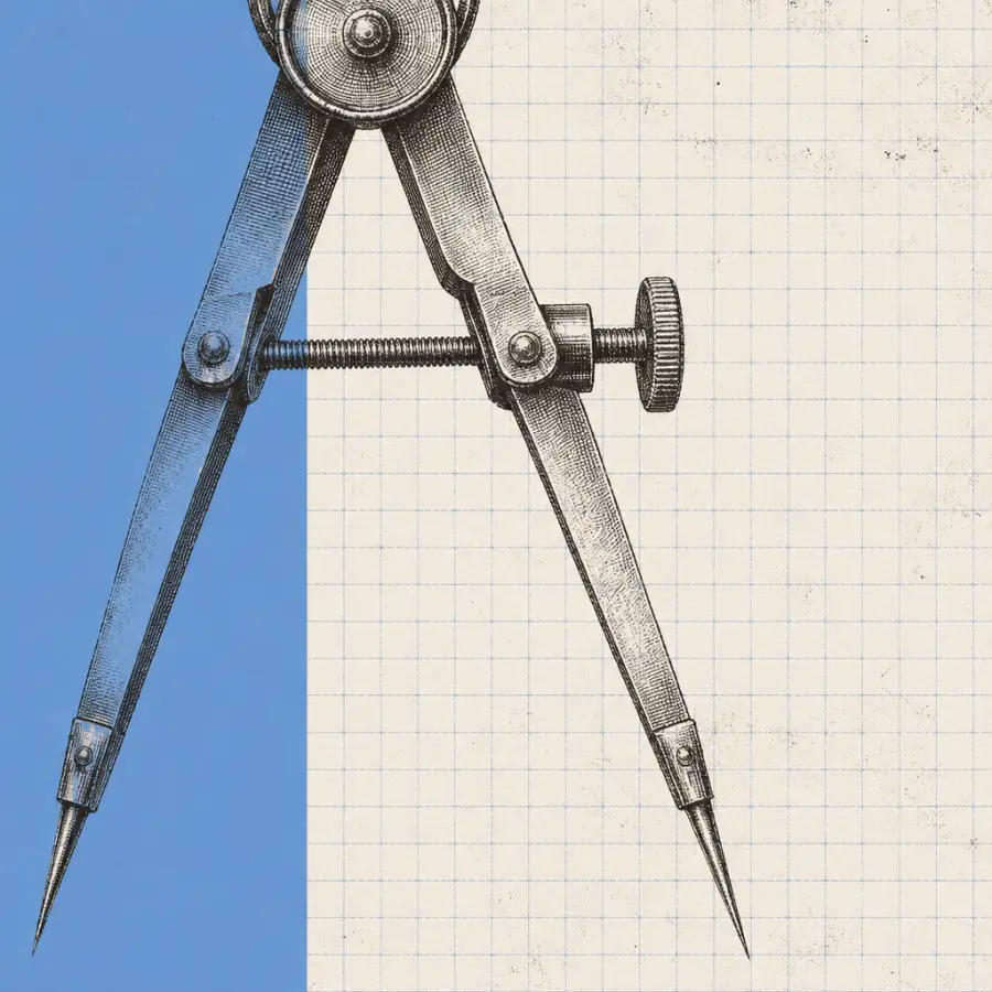
collage-drafting-compass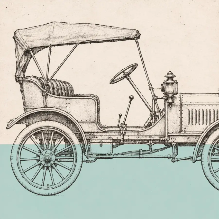
collage-automobile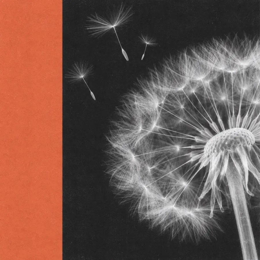
collage-dandelion-xraycollage-rosemary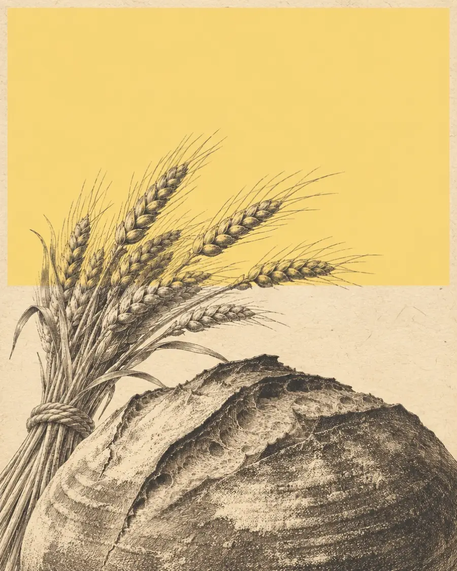
collage-sourdough
collage-pocket-watch
collage-clouds-mosaic07 — Space & shape
Space separates; borders define; shadow is only for things that float above the page.
--space-14px--space-28px--space-312px--space-416px--space-524px--space-632px--space-748px--space-864px--space-996px--space-10128pxEvery picture gets 4px corners (--radius-media), as on anthropic.com. Buttons use 10px, cards 8px, pills are fully round.
xs · 4pxsm · 8pxmd · 12pxlg · 20pxxl · 28pxfull · pill--shadow-1--shadow-2--shadow-309 — Forms
10 — Cards
Plain
A multilingual restaurant site with a seasonal menu and table booking.
Raised, as a link
Fleet, prices and online requests for a Zurich car rental. Hover me.
Haze, for one featured item
Use the haze card once, for the thing you most want people to see.
Hero and header
Rebuilt from anthropic.com. The statement sits above a picture card. As you scroll, the card's side and bottom insets and its 4px corners shrink to zero, so it grows to full width. One CSS variable, --grow, drives all three; a 15-line script sets it, reduced motion starts it fully grown, and without JS it simply stays at rest.
<h1 class="statement statement--hero"><strong>What it is.</strong> Why it matters.</h1>
<ExpandingMedia src="/pictures/haze.webp" width={1600} height={686}>
  <p class="display lockup"><span class="lockup__line">First line</span><span class="lockup__line">second line</span></p>
  <p>One sentence.</p>
  <Button href="#">Action</Button>
</ExpandingMedia>
The header puts the links as pills on the left, the wordmark exactly in the centre and the call to action on the right. On phones the wordmark moves left and the links go into the menu.
11 — Badges & callouts
Note
Tip
Heads up
12 — Prose
Wrap any long text in .prose. It switches to the serif, opens the line height and keeps the measure at 64 characters, so articles, case studies and legal pages read like a printed page.
src/styles/tokens.css and base.css into the project.Perfection is achieved not when there is nothing more to add, but when there is nothing left to take away.
Links look like this inline link: clay text with a soft underline that firms up on hover.
13 — Motion
Short, eased transitions on state changes only. The haze drifts over 28 seconds. Everything stops for prefers-reduced-motion.
--dur-fast120ms · Hover, press--dur-base200ms · Cards, menus--dur-slow420ms · Page elementsHover or focus a row. Easing: --ease-out cubic-bezier(0.22, 1, 0.36, 1).